Covering Covers (Part 2)
Variant Madness

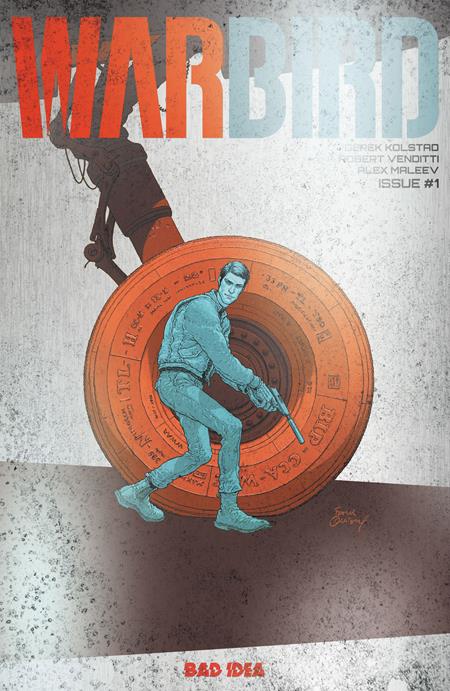
My colleague and occasional co-conspirator Martin mentioned that an upcoming indie comic (Warbird) was being released with a variant cover made of aircraft aluminum. I’ve heard of metal covers before, but that’s certainly saying something.
One of the joys of creating Dead Money as our own indie intiative has been reaching out to artists we like, getting to know them, and inviting them to join us on our wild ride.
(My wife does not understand the notion of variant covers, or why we’d do them, or why people would buy them. And I confess I cannot explain it in a way she’d understand.)
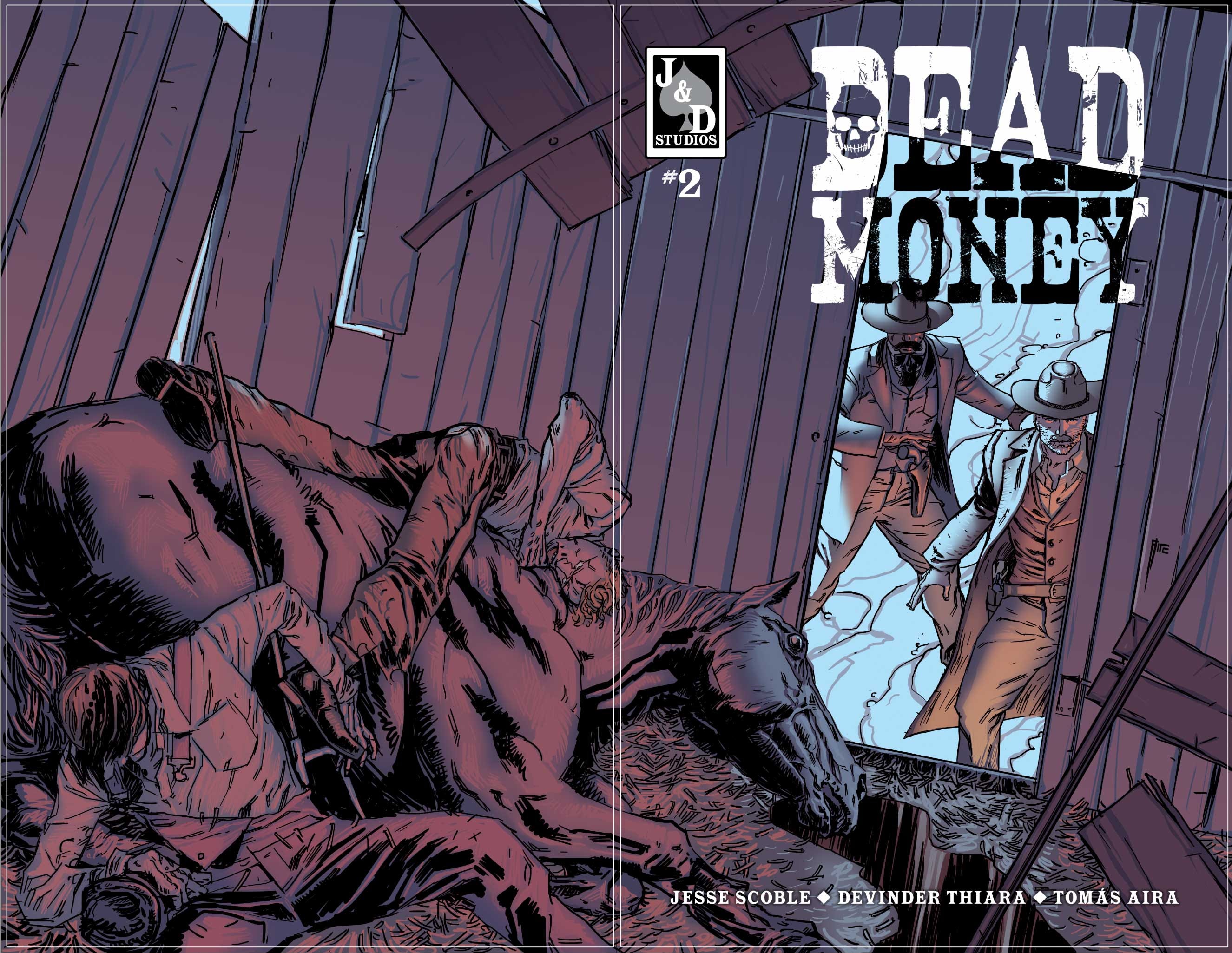
As we are finalizing everything for issue 2 (we noticed one missing sound effect graphic that Tomás has just whipped up), we are trying to lock in our designs to make each following issue easier. This doesn’t mean we won’t experiment, but gives us a stronger baseline.
The visual language for the main cover was solid, so all we’ve done for issue 2 is tweak the # designation slightly.
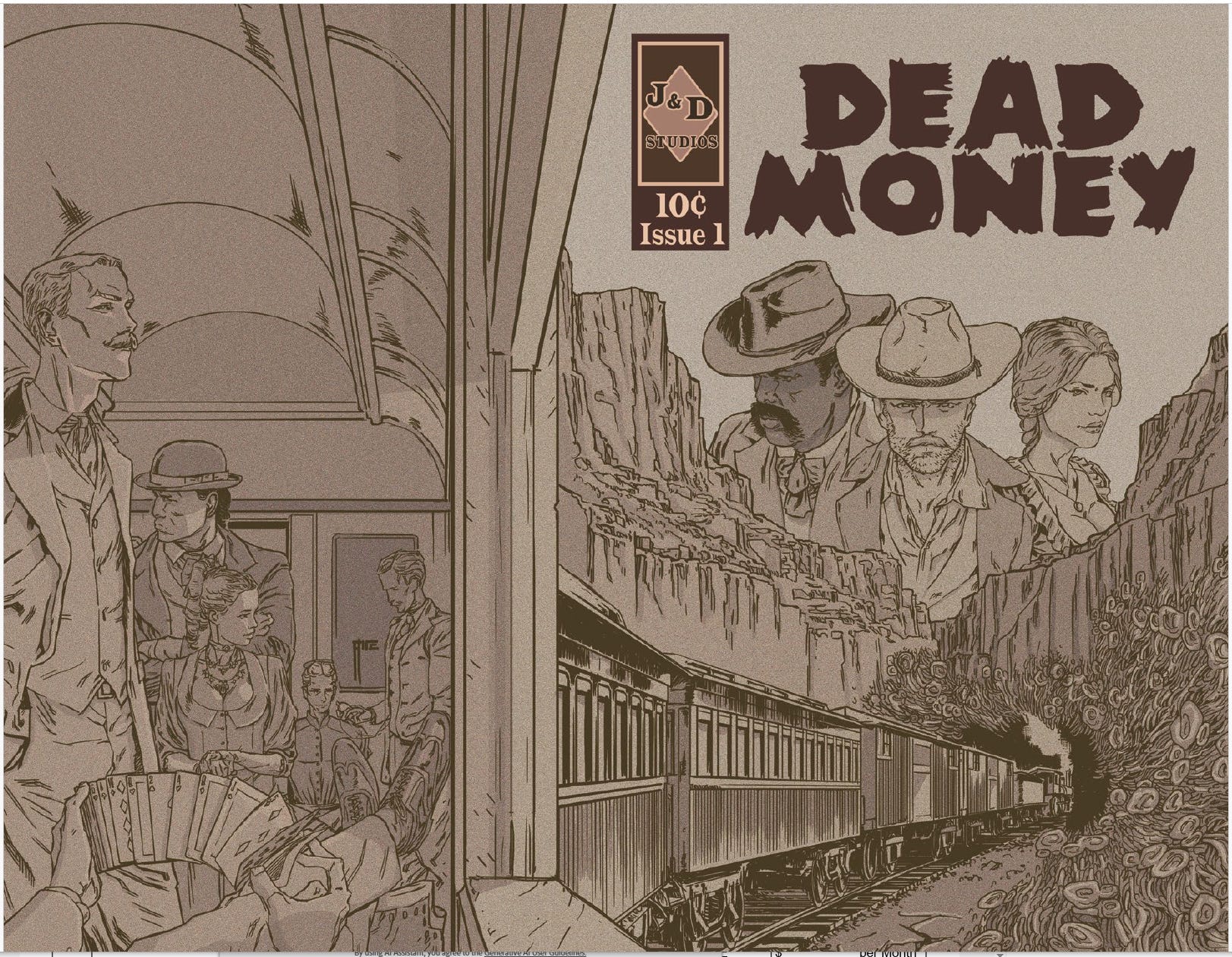
For the Pulp cover, the sepia / “old timey” variant, Steve (our newest team member) redesigned the logo box a bit, adding his own flair (Steve known the weird west!).
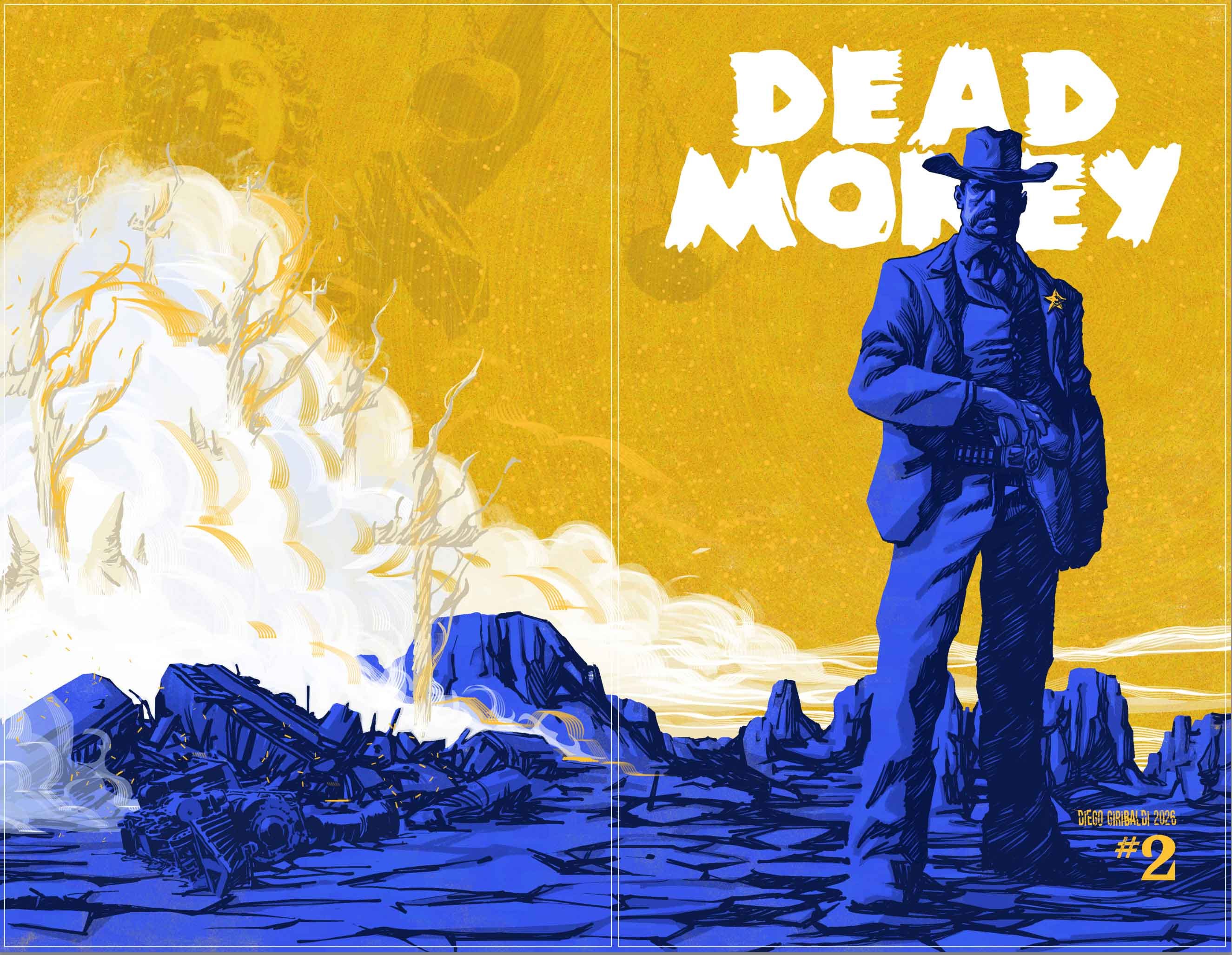
When we looked at the Diego “spotlight” variant, we were loathe to add anything beyond the Dead Money title (Zombie! font), but we worried about how people could tell what issue was what, in sequence, especially envisioning 5 or 10 of these variants.
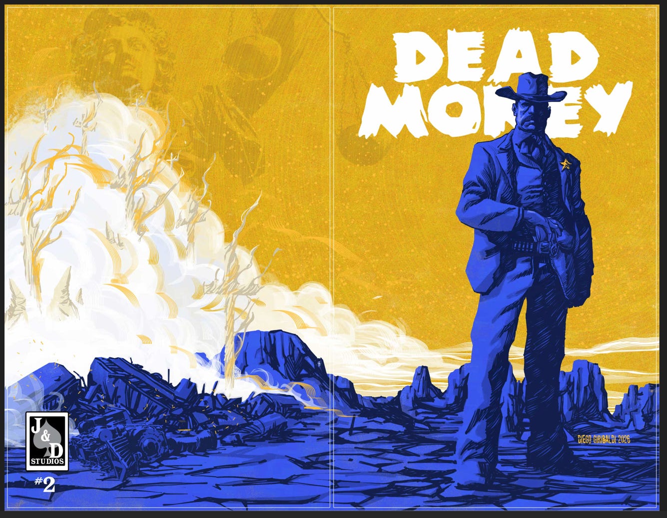
We experimented with putting the number up by the title, on the back cover with logo (like the Moon cover), or down by Diego’s signature. The last looks best to me, and once we see a test print, hopefully all will agree.
Similarly, for Jose Holder’s “Zombie Campfire” cover (like Mato Saw’s “Moon” cover) we have our company logo on the back, but again wanted to add the issue number.
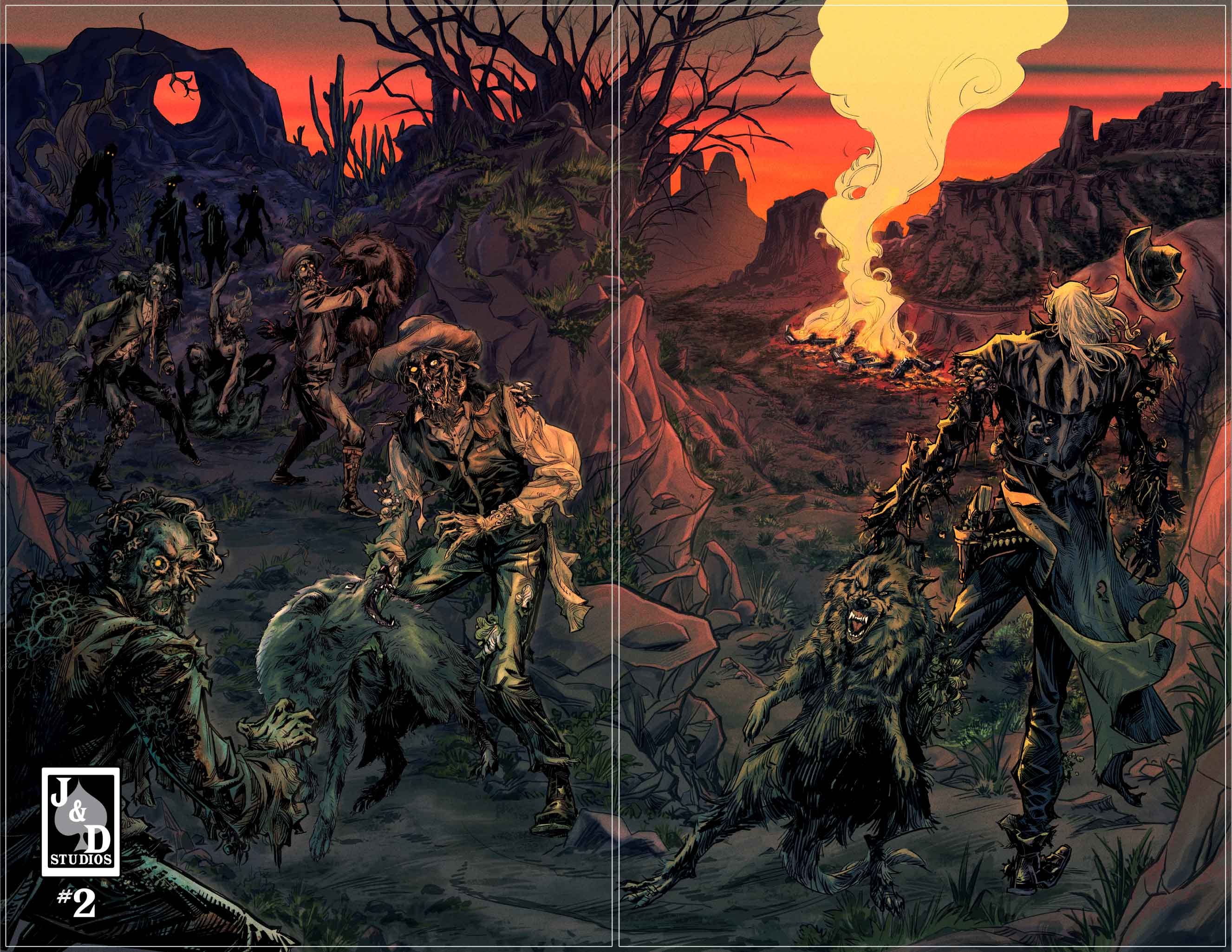
It’s a thrill to show the off and we hope you enjoy ‘em as much as we do.
In the meantime… I’m off to GenCon!
Love it!! Thanks, Jesse:)